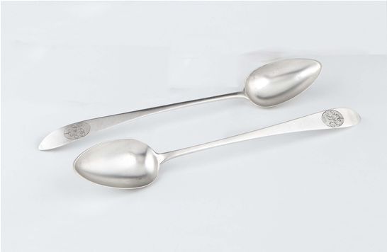
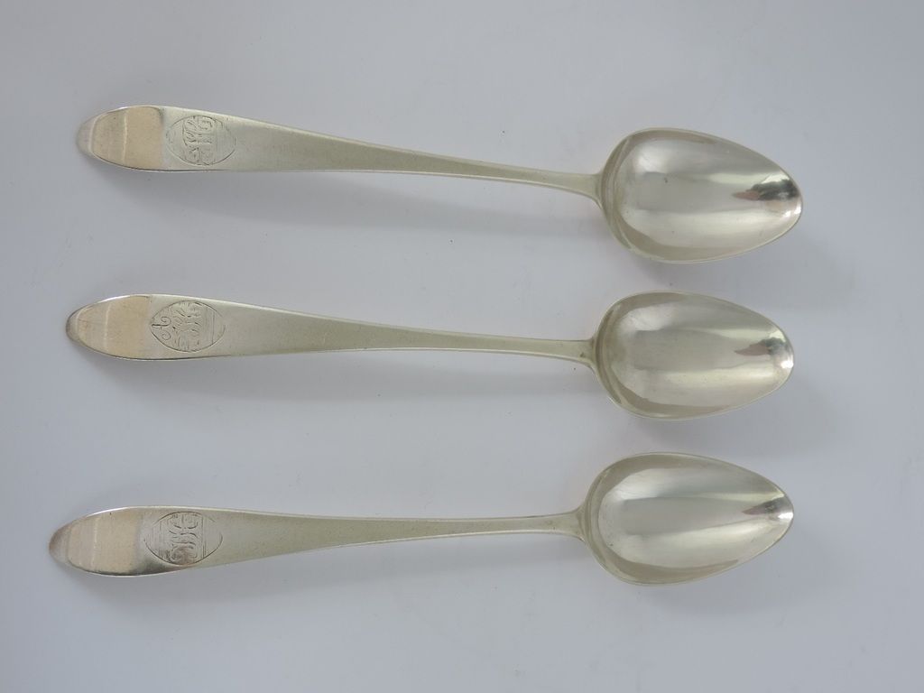
The example shown here is on a basting spoon by Carden Terry and dates from c. 1790.

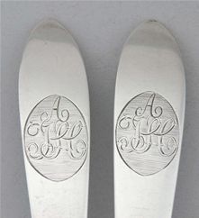
Do you recall what type of silverware? Was it usually on spoons?"JCE" which are frequently found on items of Cork silver
nobilityhouse wrote:I see a superscript M above the C before the E. Good luck with this.
This is also my interpretation of these initials.Traintime wrote:...the initialing here is H before E with super M intertwinedM....
Very many thanks traintime. Looking at it again, I think you are perfectly correct.Traintime wrote:You've got my interest now! That small "v" shape to the left of the C and below the super M did not seem right. Looking at old pen lettering guides I have come the the conclusion that the initialing here is H before E with super M intertwined, not JCE. This would be consistent with engraving for a married couple using the last name initial to tie together the two first name initials, a practice still in use. Further, J's are often designed basically like the left leg of the H to simplify creating the style, and generally extend below the other letters. A style called " Divinity" shows all these aspects very well. C's would almost never have this little hash sticking out of their left. Finally, this would give more balance to the centering of the super M.