»Saint Macro of Distortions«
Hello All
Thank you all for yours contributions in the »
Russian«
section! In the very past I’ve got the impression, if actually some body is bored, but like to enlarge his knowledge, he should read the »
Russian«
topics — with other words, actually there is the »
kitchen«.
I’ve read many of the past topics, also I wasn’t bored either. So I’ve got knowledge also from discussed details of how original punches must be, and their fakes.
»
Buckler« was already in the past the »
925-1000« contributor who
made research by studying details from details —
that has always amazed me.
Now »
Qrt.S« in his contribution from
Tue Jan 25, 2011 3:40 pm introduced a »
line of differentiation«;
for to could understand the differences of letters in their optical appearance, and it’s useful for ciphers as well. By the way: 2, 3, 5, 6, 8, 9, 0, a, b, C, c, d, e, f, G, g, J, O, o, p, Q, q, S, s, U, u are ciphers and letters which have to be passing with their ‘circular’ elements a little bit the top and/or bottom line — otherwise they look alike not to be correct.
Please see here »
Qrt.S« contribution:
http://www.925-1000.com/forum/viewtopic ... 46&t=22989" onclick="window.open(this.href);return false;
Already before
(sorry I couldn’t find it back just now) »
Postnikov« requested »
Dad«, to show for comparisons of marks here in the Forum
not “
side view”
images, but please only “
top views”.
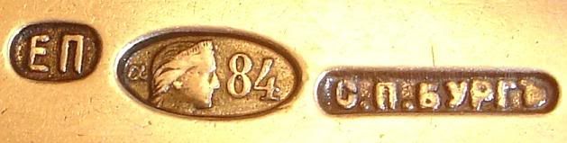
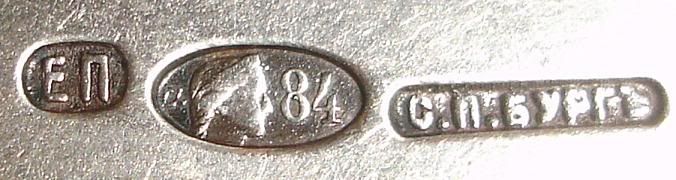
That’s in principle well correct!
But that kind of »
top view« is the kingdom of »
Saint Macro of Distortions«
!
A little discourse in between: Professional portrait photographer use for portrait an objective for distances — to prevent distortions, e.g. contra ears like sails, noses like to be the »Mount Everest« …
For Macro photography is a wide angle position of the zoom-objective the almost usual offer of the actual digital photography.
But these images are all distorted!
Well, »
Postnikov«
is in principle on a very correct line of comparisons —
but all these images must be taken only in very similar optical conditions!
But it looks like, that that isn’t here the case!
So it’s in principle
illegitimate to place more as only a »
centre line« for comparisons.
The more the comparison lines are placed near the border of the image, it doesn’t matter if it’s on the top or the bottom, left- or right-side, and there are the distortions.
The item’s area which should be imaged and the camera must
always be centred and horizontally levelled to each other —
otherwise …
Very special macro-objectives are necessary for images without distortion, and these aren’t ever the cheap ones!
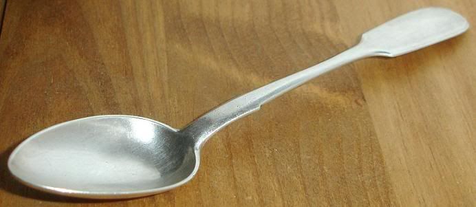
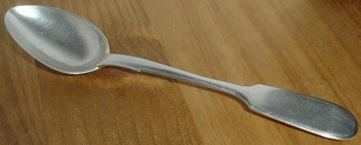
To prevent at least some problems of distortion, well my argument there is for reason of lightning, with the preferred side effect of preventing distortion, I’ve already recommended, to
make photos out of some distance, and then after
clip out the marks area.
http://www.925-1000.com/forum/viewtopic ... 34&t=19420" onclick="window.open(this.href);return false;
Another problem was or still is, to make a »
white calibration« (»
white balance«)
in advance of taking photos, if it’s necessary for reasons of comparison to have e.g. the red enamel of Faberge correct shown.
Thank you All for be holding this in mind too.
Kind regards silverport