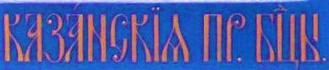
Iconography has its rules; Kazan Icon of the Mother of God can have variants of the same inscription the Most Holy Mother of God of Kazan in Old Slavic alphabet, the last two letters on the right are
П Б abbreviation of Пресвятой Богородицы in Russian.
The last letter in Kazan which looks like
ж is poor imitation of Old Slavic letter denoting possession which is not used any more (not to be confused with modern Russian letter ж.Obviously made by a person not familiar with Old Slavic lettering.Often seen in Far East fakes with visual imitation of Cyrillic letters without knowing their meaning.
Authentic inscription:
There is more:
The mark imitating Moscow with 84 and poorly executed or missing notches.
Displaced dots in maker's mark A.P. (unknown to me in Moscow,if town mark pretended to be Moscow).
And last but not least very poorly depicted Mary and Christ, almost cartoon like.
Regards


